Sandwich Land App
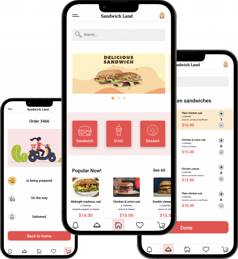
Within the scope of Google’s UX Design Professional Certificate, I have created an app that has contributed to my learning. The objective of the assignment was to create a mobile application entirely from scratch, focusing on a specific subject matter that each participant selected at the beginning of the course. In my case, I chose to design a mobile application for a sandwich shop.
Project Overview
Sandwich Land is an app that cares about healthy eating and helps people with special diet or allergy, finding the full list of ingredients and customizing their own sandwiches. The typical user is between 18-40 years old and most users have special diet to follow. The app goal is to make the customization process easy and useful.
The Problem
Some available food ordering apps have no clear navigation and options to customize the order due to special diet or allergy.
The Goal
Design an app to help people easily customize their orders.
My Role
UX Designer
Responsibilities
User research, conducting interviews, paper and digital wireframing, low and high-fidelity prototyping, conducting usability studies, and iterating on designs.
My Hi-Fi prototype followed the same user flow as the Lo-Fi prototype, and included the design changes made after the usability study.
Click to see High-Fidelity Prototype
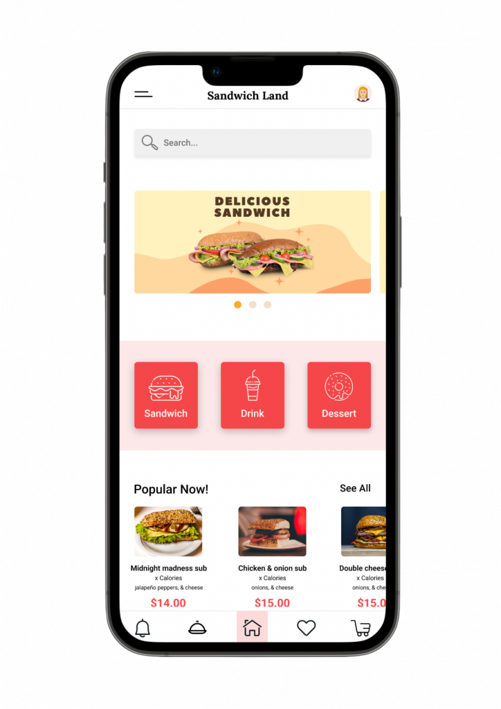
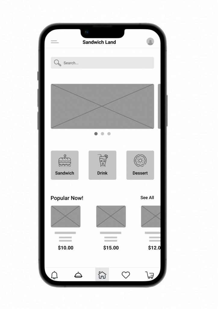
To create a Lo-Fi prototype, I connected all of the screens involved in the primary user flow of ordering and customizing a sandwich.
At this point I had received feedback on my designs and prioritized them and made changes to the design based on the feedback I received.
Click to see Low-Fidelity Prototype
Understanding The User
User research | Personas | User story | Problem statements | User journey maps | Competitive audit | Goal statement | User flow | UX design storyboard
User Research: Summary
I conducted user interviews and usability studies, which I then turned into empathy maps to better understand the target user and their needs. I discovered that many target users can’t order online due to the lack of facilities to customize their order. Some people have very strict diet or allergy that having the option to customize all the ingredient of the order can be a lot helpful for them and they can have their food delivered to their place.
User Research: Pain Points
Time
Most people are really busy to prepare meals.
Customization
Some people have allergy to some foods or have a special diet.
Experience
Some online food ordering apps do not have an engaging browsing experience.
Personas
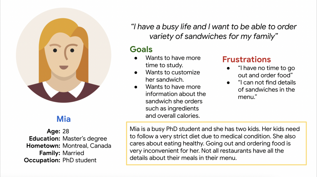
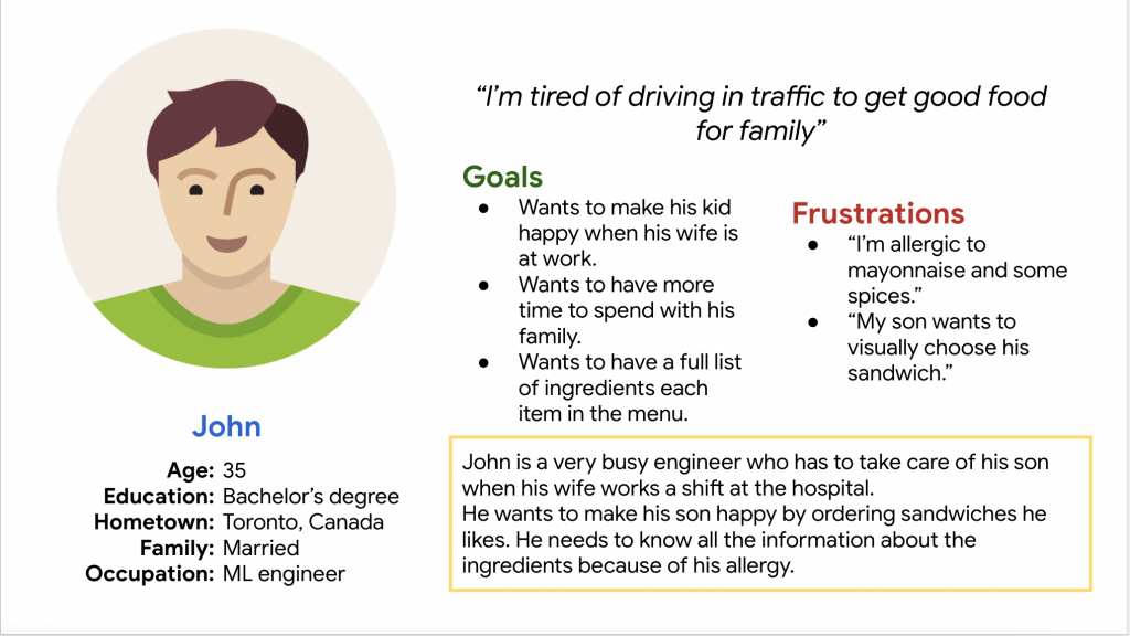
I created two personas based on research. They embody the characteristics, motivations, and behaviors of real users, allowing designers to better understand their needs and goals.
Personas guide design decisions by representing the target audience.
User Story
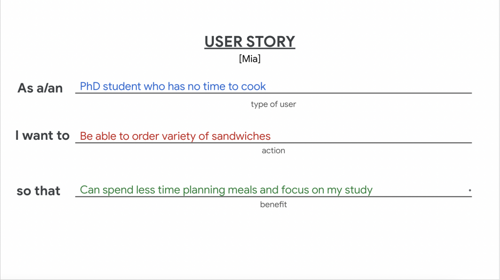
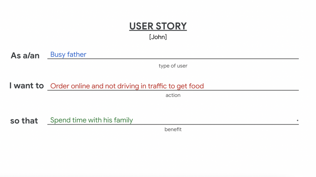
The user story explains the value or benefit the user expects to gain from using the product. It outlines how the user’s life or workflow will be improved, highlighting the positive outcomes.
I made two user stories based on my personas.
Problem Statement
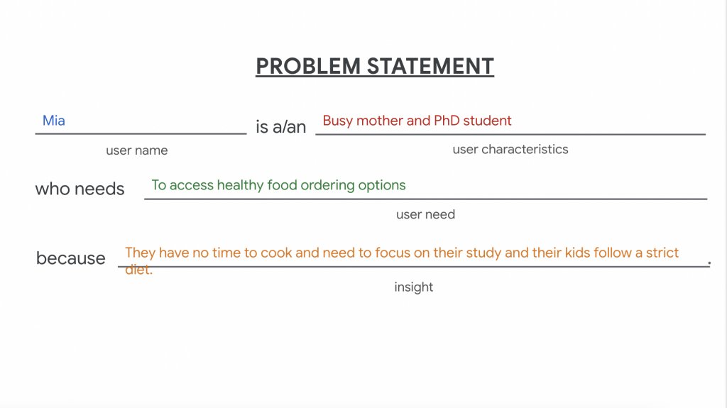
A problem statement helps designers focus on finding effective solutions and guides the decision-making process throughout the design.
Here is an example of the problem statement that I made based on my personas through the design process.
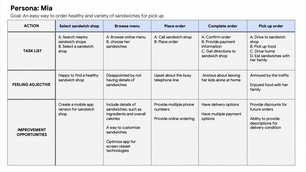
User Journey Map
By visualizing the user’s journey, I gained valuable insights into the user’s perspective, pain points, and opportunities for improvement and ultimately enhanced the overall user experience.
Competitive Audit
I compared strengths, weaknesses, and overall user experience strategies employed by 4 similar companies. In this step I gained insights into how other organizations approach UX design and identified opportunities for improvement.
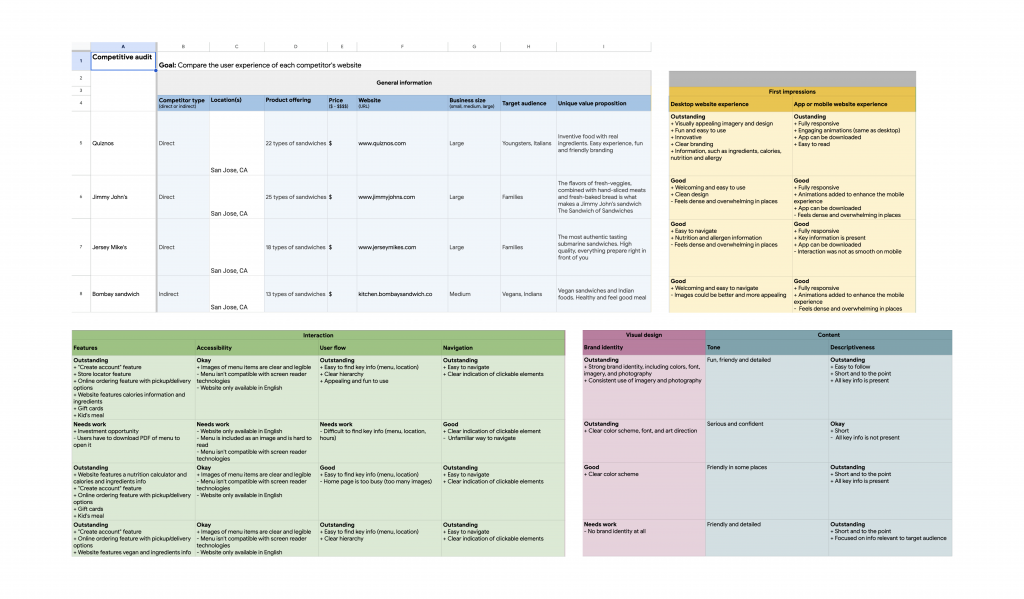
Click to see Competitive Audit
Click to see Competitive Audit Report
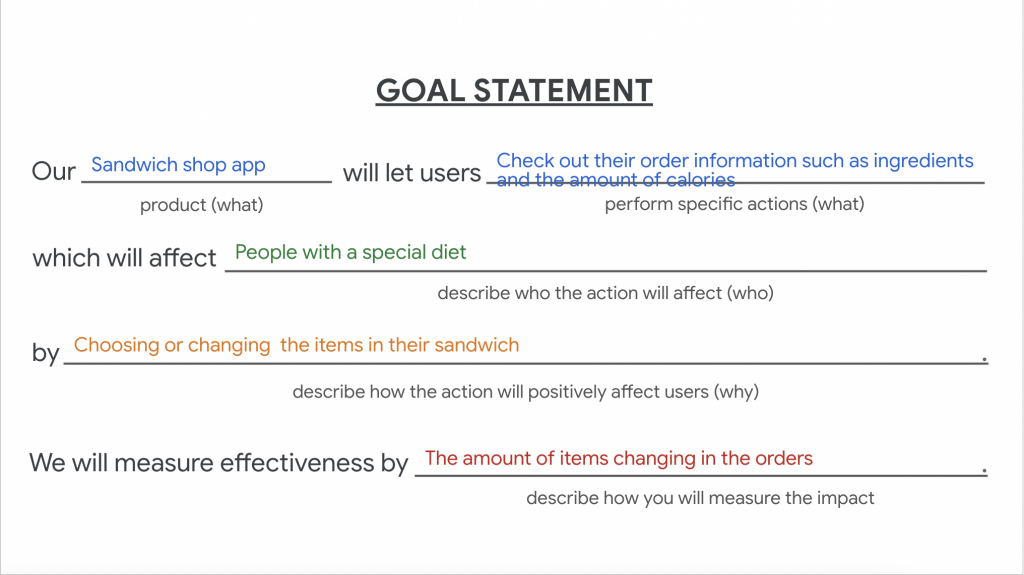
Goal Statement
The goal statement outlines what the design is aiming to achieve. It acts as a guiding principle to align the design process with the intended purpose and audience, ensuring that the resulting product or experience meets the desired objectives.
User Flow
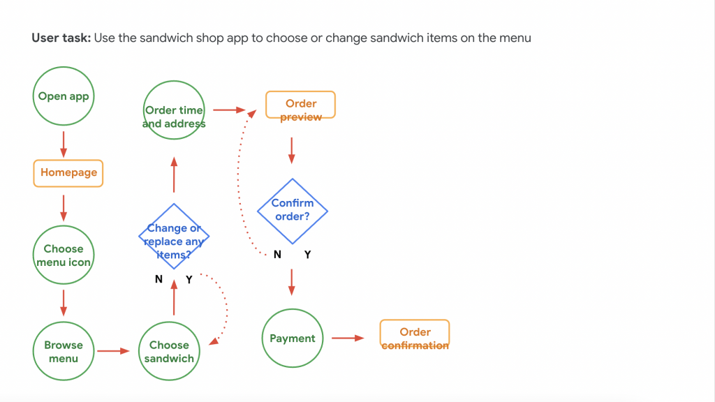
A user flow refers to the path or sequence of steps that a user follows to accomplish a specific task or goal within a product or website. It illustrates the journey that a user takes from the initial interaction with the interface to the completion of their objective.
Having a flow chart, helped me write my scenario and test it on users.
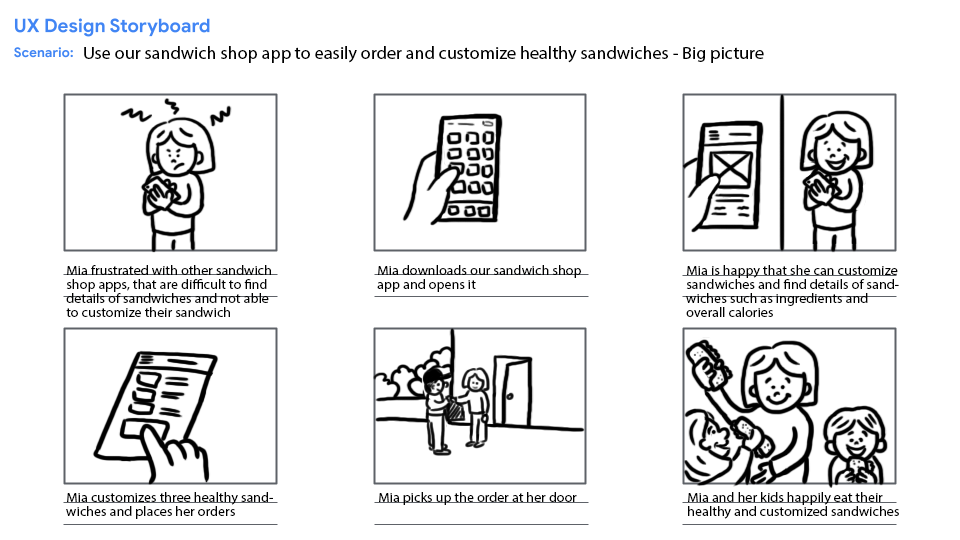
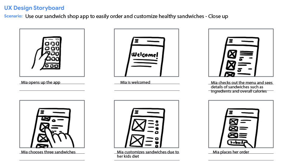
UX Design Storyboard
Here I illustrated frames that showcase the different steps, interactions, and emotions of the user throughout their interaction.
It helped me to identify potential pain points, obstacles, or confusing moments in the user experience.
Starting The Design
Paper wireframes | Digital wireframes | Usability studies | UX research study plans | Usability study note-takings | Pattern identification | Insight identification
Paper Wireframes
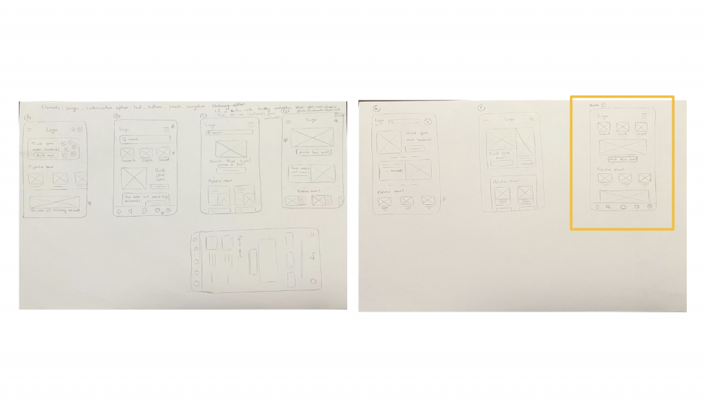
Next, with the user pain points in mind; I sketched out paper wireframes.
You can find the refined paper wireframe highlighted.
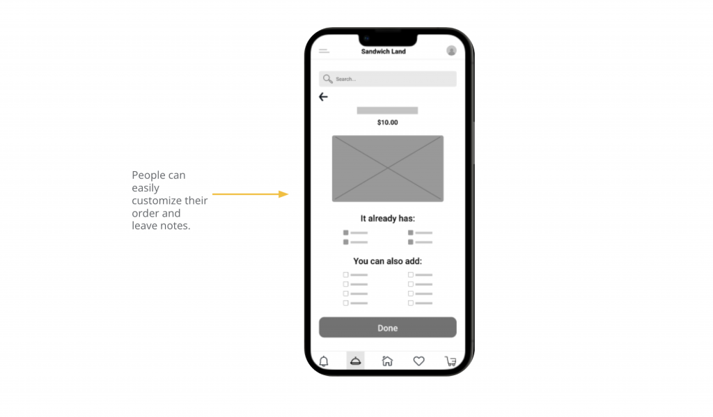
Digital Wireframes
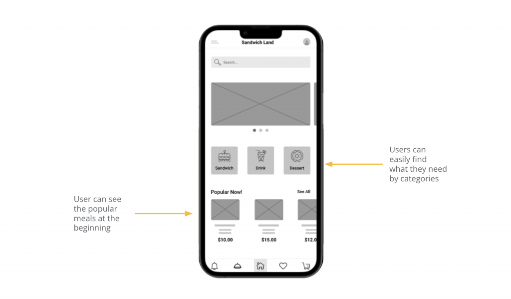
Moving from paper to digital wireframes made it easy to understand how the redesign could help addressing the user pain points and improving the user experience.
Digital Wireframes
Prioritizing useful visual elements placement was a key part of my strategy.
Usability Study: Findings
I conducted two rounds of usability studies. You can find main findings here:
Round 1 Findings:
1
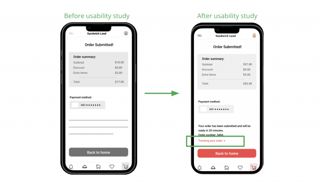
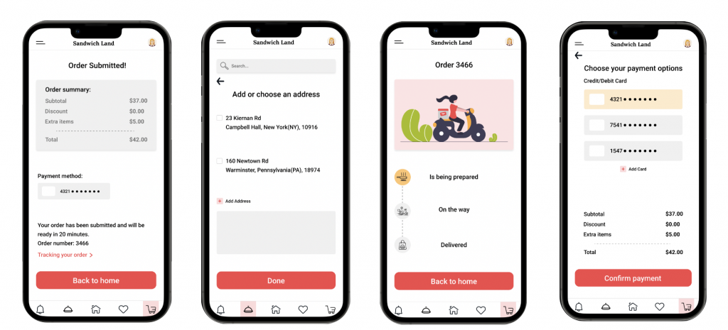
Users want to see a receipt.
2
Users want to see an order tracking option.
3
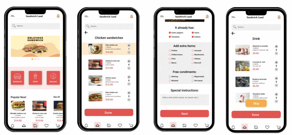
Users want to have an option to select drinks or desserts right after they choose their sandwich.
Round 2 Findings:
1
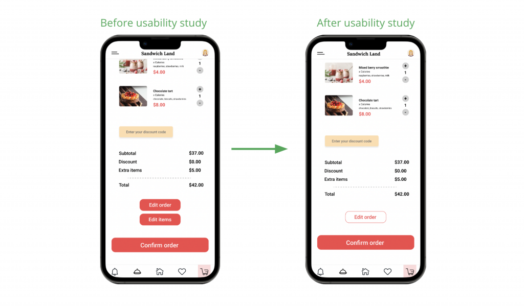
‘Edit order’ and ‘edit items’ buttons are confusing.
2
Need of having ‘back’ button in some places.
UX Research Study Plan 1
Click to see UX Research Study Plan 1
Usability Study Note-Taking 1
Click to see Usability Study Note-Taking 1
UX Research Study Plan 2
Click to see UX Research Study Plan 2
Usability Study Note-Taking 2
Click to see Usability Study Note-Taking 2
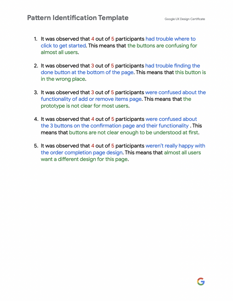
Pattern Identification
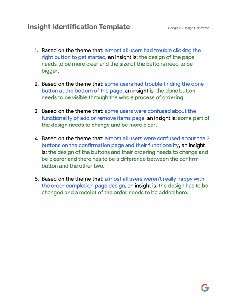
Insight Identification
Refining The Design
Mockups | Accessibility
Mockups
Based on the insights from the usability study, I made changes to make improvements. I added an option for users who want to track their order.
Having two editing buttons was confusing for the users, so I decided to combine the two and only have one editing button.
Other mockups of the app:
Accessibility Consideration
I used relative icons and images to make the navigation easier.
Takeaways
Impact
Users were happy with the new changes and new features added. They could easily customize their order.
What I learned
I learned that even a small design change can have a huge impact on the user experience. The most important takeaway for me is to consistently prioritize the genuine needs of the user when coming up with design concepts and solutions.
Get in Touch
If you are interested to work with me email me at sara.hajimiri@gmail.com
