Green Animal Rescue
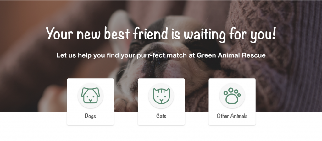
As part of my completion of Google’s UX Design Professional Certificate, I have created a website. The assignment was creating a website entirely from the ground up, focusing on a specific subject that we individually selected at the beginning of the course. For this project, I chose to design a website for an animal shelter named “Green Animal Rescue.”
Project Overview
Green Animal Rescue is a website that helps people easily search and adopt a pet and make donations. The typical user is between 18-50 years old and most users are animal lovers. The website goal is to make adoption and donation process more easily.
The Problem
It’s really hard to say if an animal shelter is real or a scam due to poor design and UX.
The Goal
Design a friendly and intuitive website with clear photos and descriptions of the animals and the ways that people can help them.
My Role
UX Designer
Responsibilities
User research, conducting interviews, paper and digital wireframing, low and high-fidelity prototyping, conducting usability studies, iterating on designs and responsive design.
My Hi-Fi prototype followed the same user flow as the Lo-Fi prototype, and included the design changes made after the usability study.
Click to see High-Fidelity Prototype
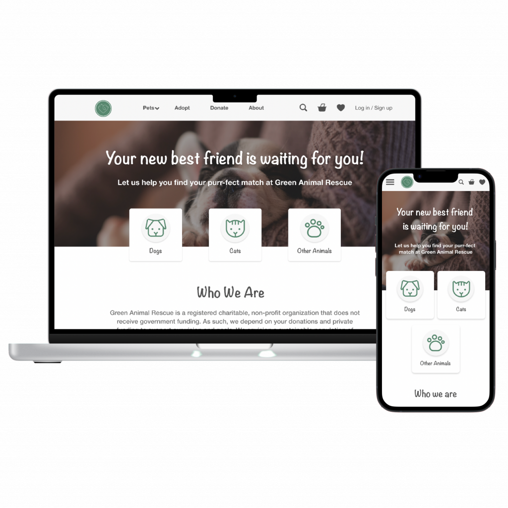
To create a Lo-Fi prototype, I connected all of the screens involved in the primary user flow of making a donation to a pet. At this point I had received feedback on my designs and prioritized them and made changes to the design based on the feedback I received.
Click to see Low-Fidelity Prototype
Understanding The User
User research | Personas | User story | Problem statements | User journey maps
User Research: Summary
I conducted user interviews and usability studies, which I then turned them into empathy maps to better understand the target user and their needs. I discovered that many target users even when they don’t have the opportunity to adopt a pet they are willing to make donation and want to have a clear path for that.
User Research: Pain Points
Navigation
Animal shelter website designs are busy most of the time, which result in confusing navigation.
Interaction
Too much information that might overwhelm the user.
Experience
Most animal shelter websites don’t provide an engaging browsing experience
Personas
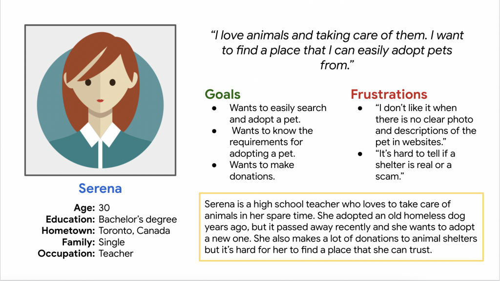
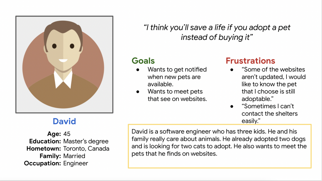
I created two personas based on research and data gathered about real users to understand their goals, behaviors, needs, and preferences. Personas help designers to empathize with users by considering their goals and frustrations throughout the design process.
User Story
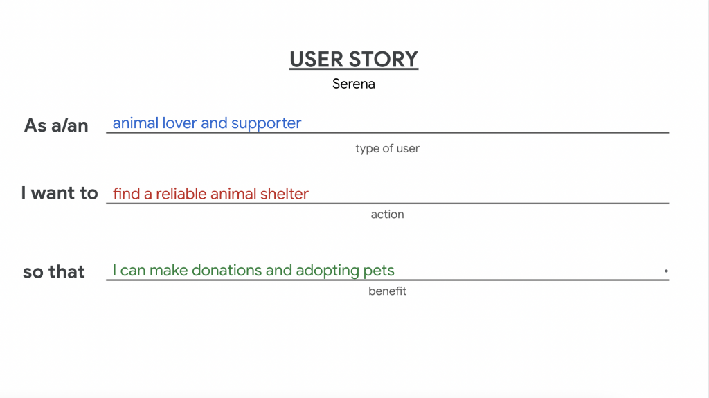
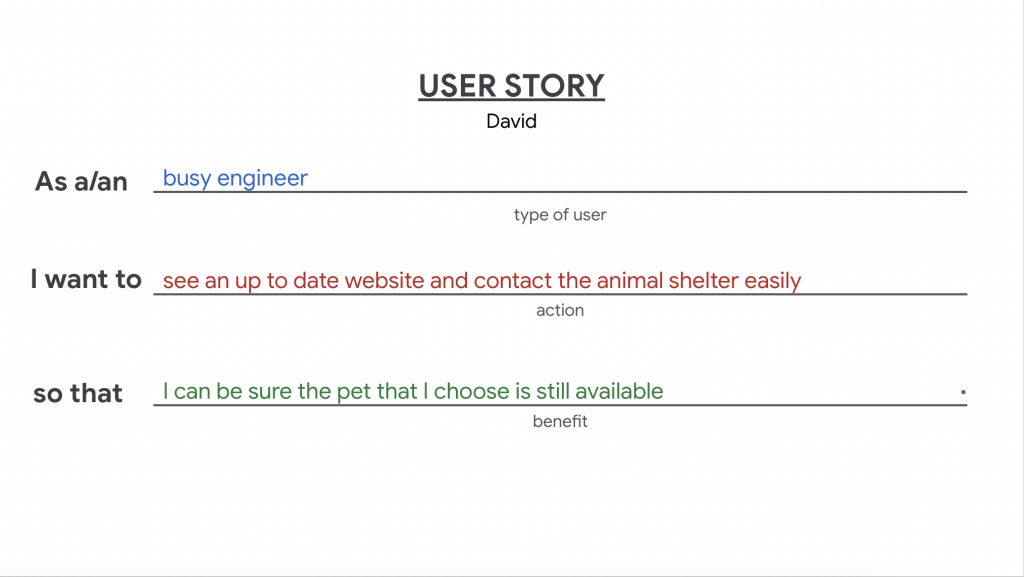
The user story highlights the user’s objective or need. It defines what the user is trying to accomplish or the problem they are seeking to solve through the product.
I created two user stories based on my personas.
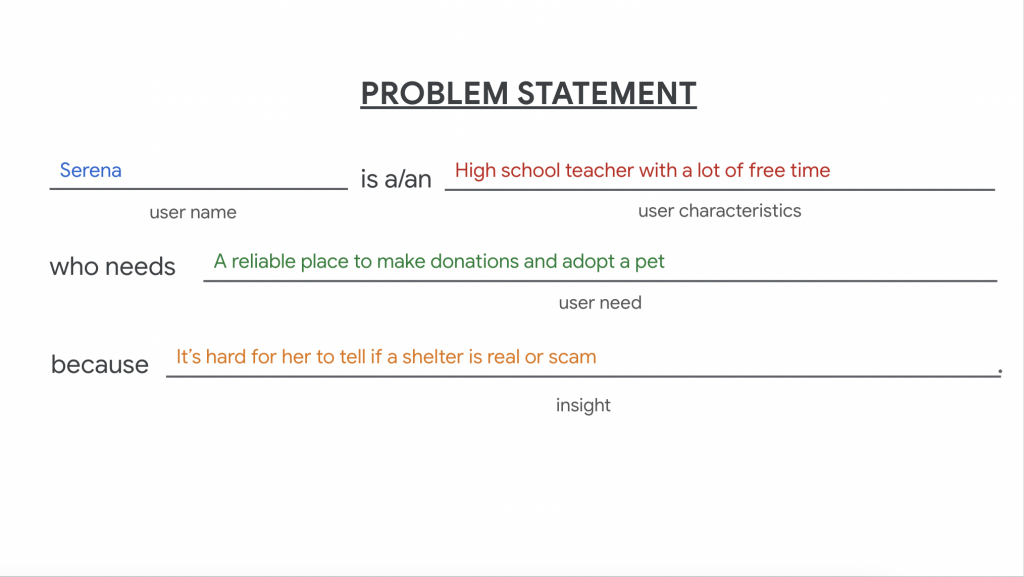
Problem Statement
The problem statement provides a brief description of the problem or challenge faced by the users. It outlines the pain points, frustrations, or obstacles that users encounter when using a product or trying to achieve a specific goal.
I made a problem statement based on one of my personas.
User Journey Map
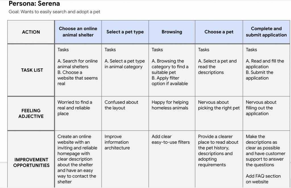
I created a user journey map of Serena’s experience using the site to help identify possible pain points and improvement opportunities.
The journey map outlines the specific actions and interactions the user performs at each stage and identifies opportunities for improvement and innovation.
Starting The Design
Sitemap | Paper wireframes | Digital wireframes | Usability studies
Sitemap
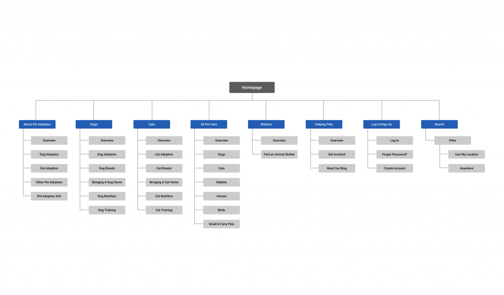
One of the main pain points of the similar websites was website navigation, I used that knowledge to create a sitemap. My goal here was to improve the website navigation.
Sitemaps are valuable as they help in organizing content, defining navigation, and ensuring a coherent and intuitive user experience.
Paper Wireframes
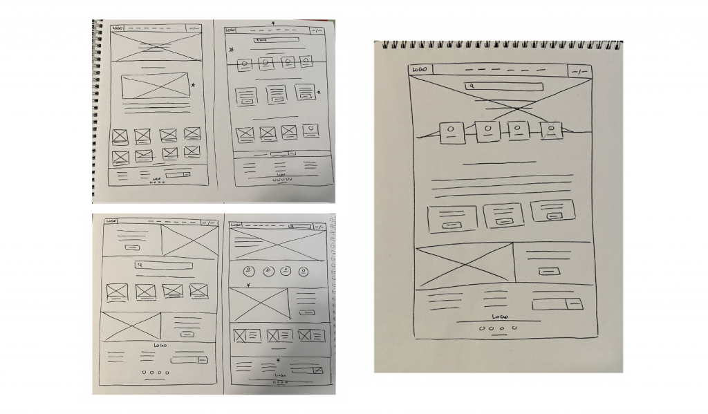
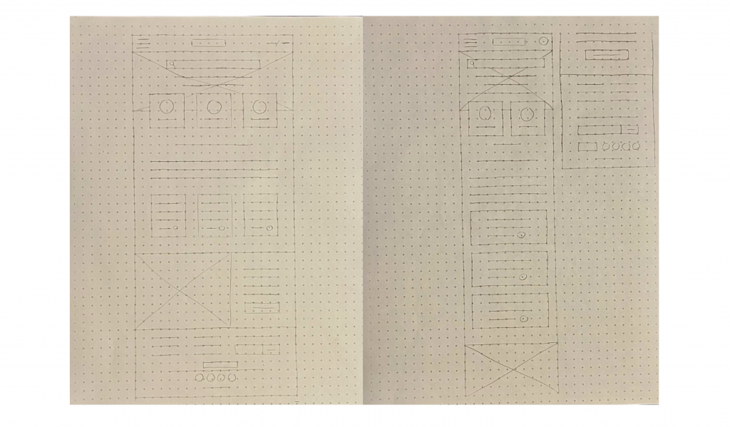
Next, with the user pain points in mind; I sketched out paper wireframes for each screen. You can find the refined paper wireframe on the right.
Paper Wireframes Screen Size Variation
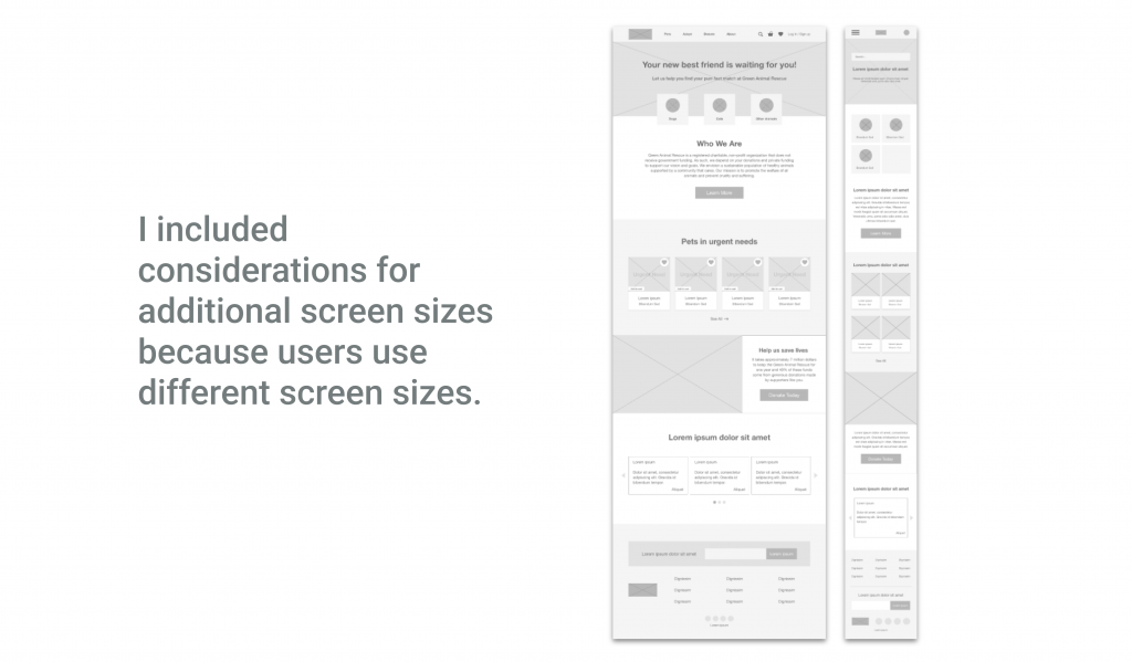
Since some users of the Green Animal Rescue might use other devices to browse the website, I started to work on designs for additional screen sizes to make sure that the website is fully responsive.
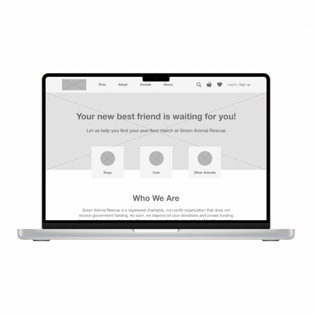
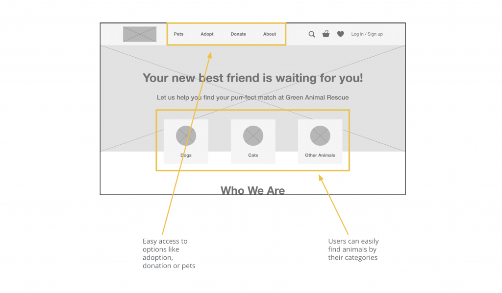
Digital Wireframes
Moving from paper to digital wireframes made it easy to understand how the redesign could help address user pain points and improve the user experience.
Prioritizing useful visual elements placement on the homepage was a key part of my strategy.
Digital Wireframes Screen Size Variation
Usability Study: Parameters
Study Type
Unmoderated usability study
Location
Canada, remote
Participants
5 participants
Length
15-20 minutes
Usability Study: Findings
Main findings of the usability study:
About
CTA buttons placement was at the bottom of the page and hard to reach.
Donation (Check out)
The page is too long and some parts are not necessarily informative.
Information
Having too much information in some pages.
UX Research Study Plan
Click to see UX Research Study Plan
Usability Study Note-Taking
Click to see Usability Study Note-Taking
Refining The Design
Mockups | Accessibility
Mockups
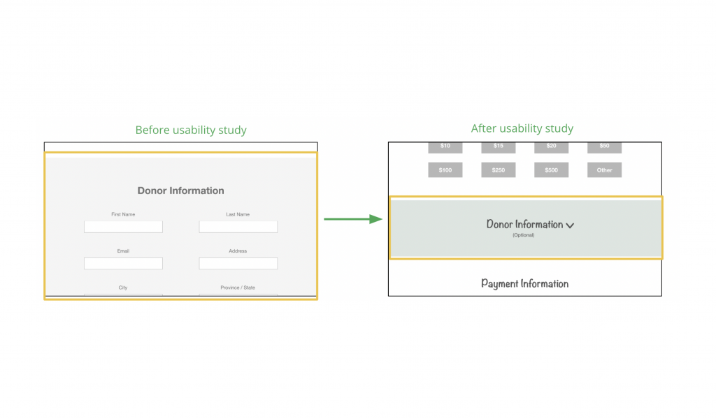
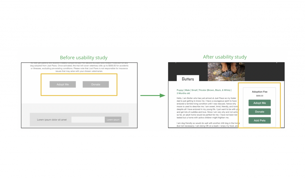
Based on the insights from the usability study, I made changes to make improvements. Since there’s need to be a lot of scrolling for this page and perhaps some information weren’t necessary because it is a voluntary work… I decided to make the donor information part as an optional section and it is collapsed to save some space.
CTA buttons were at the bottom of the page before the footer and they were out of reach, so I decided to put them at the top next to the description and fix its position while scrolling so that we can have them all at the same time when the user scrolls down.
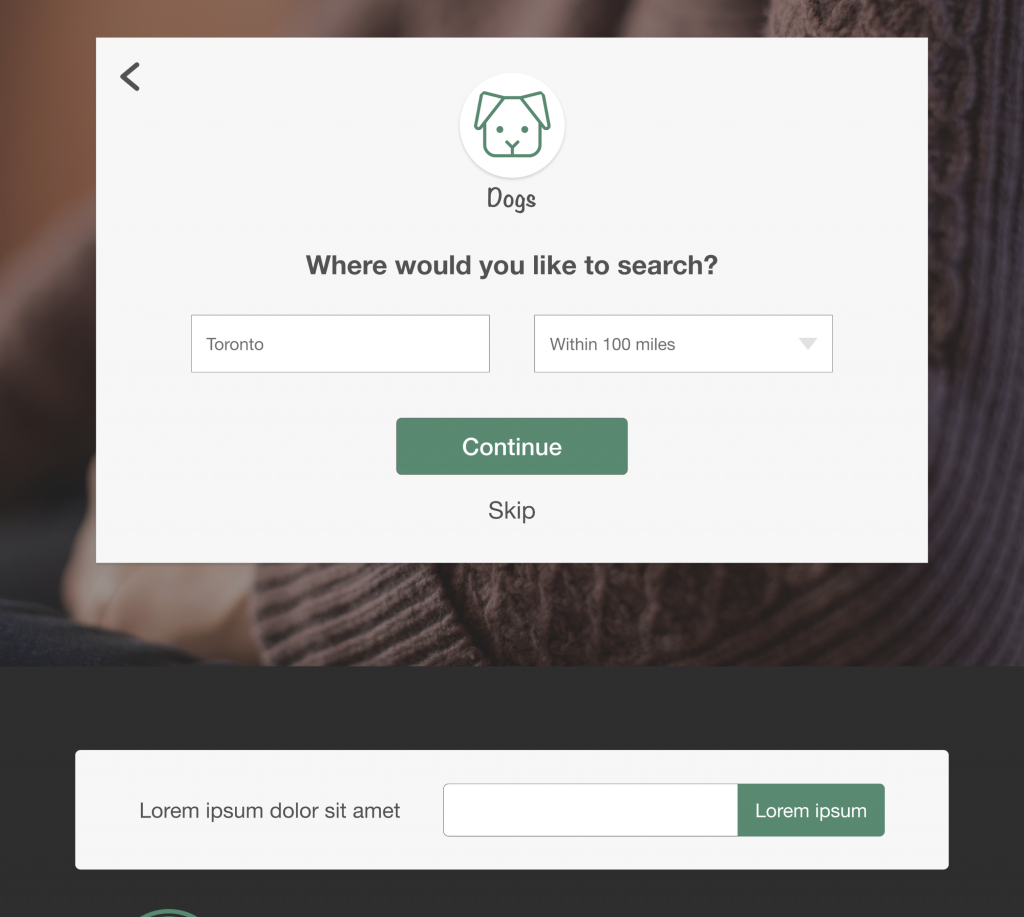
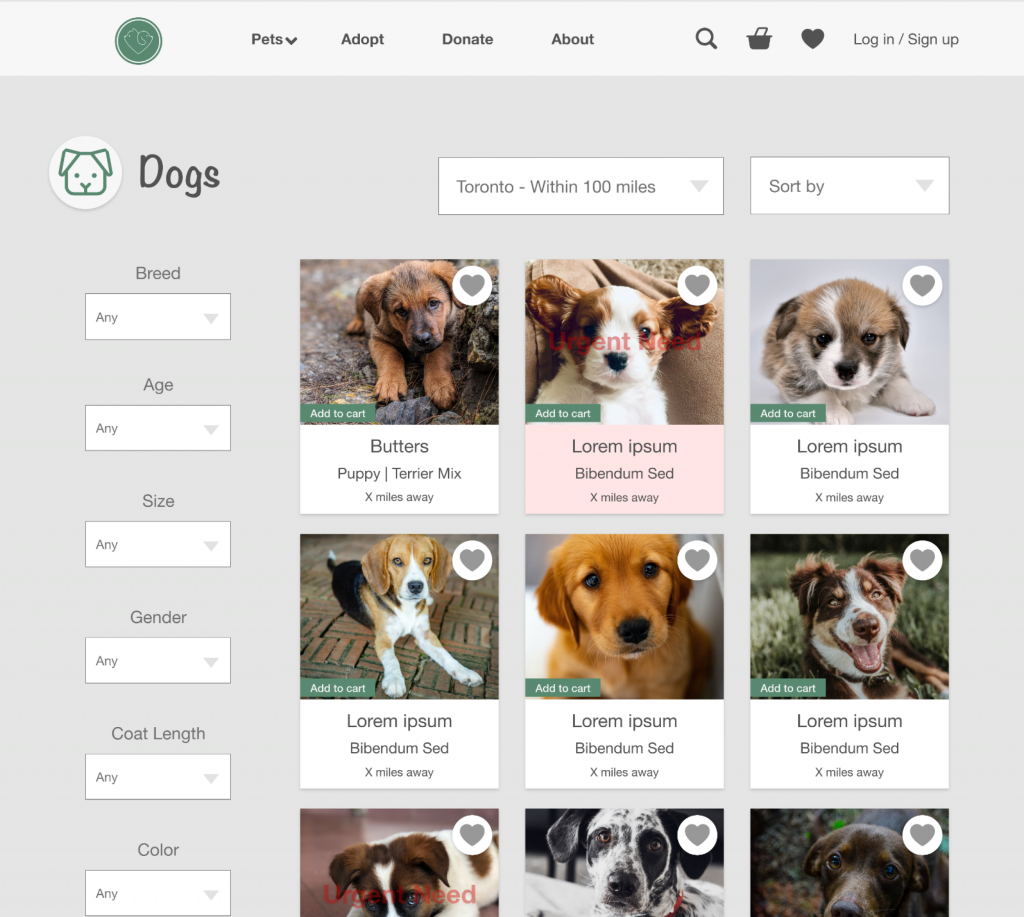
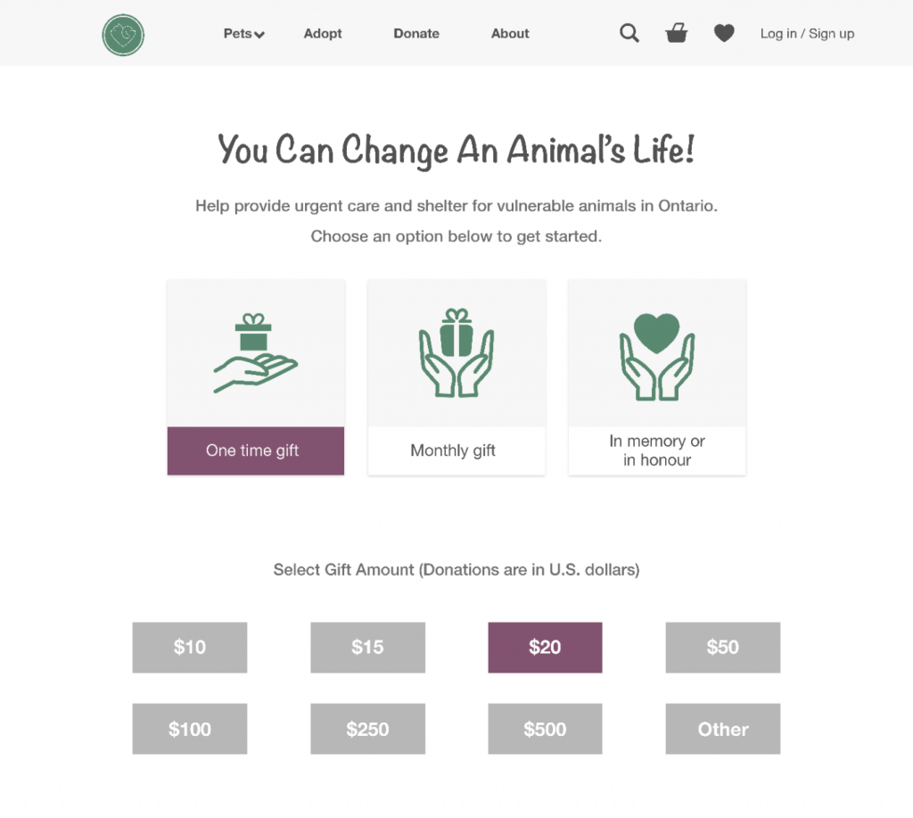
Other mockups of the website:

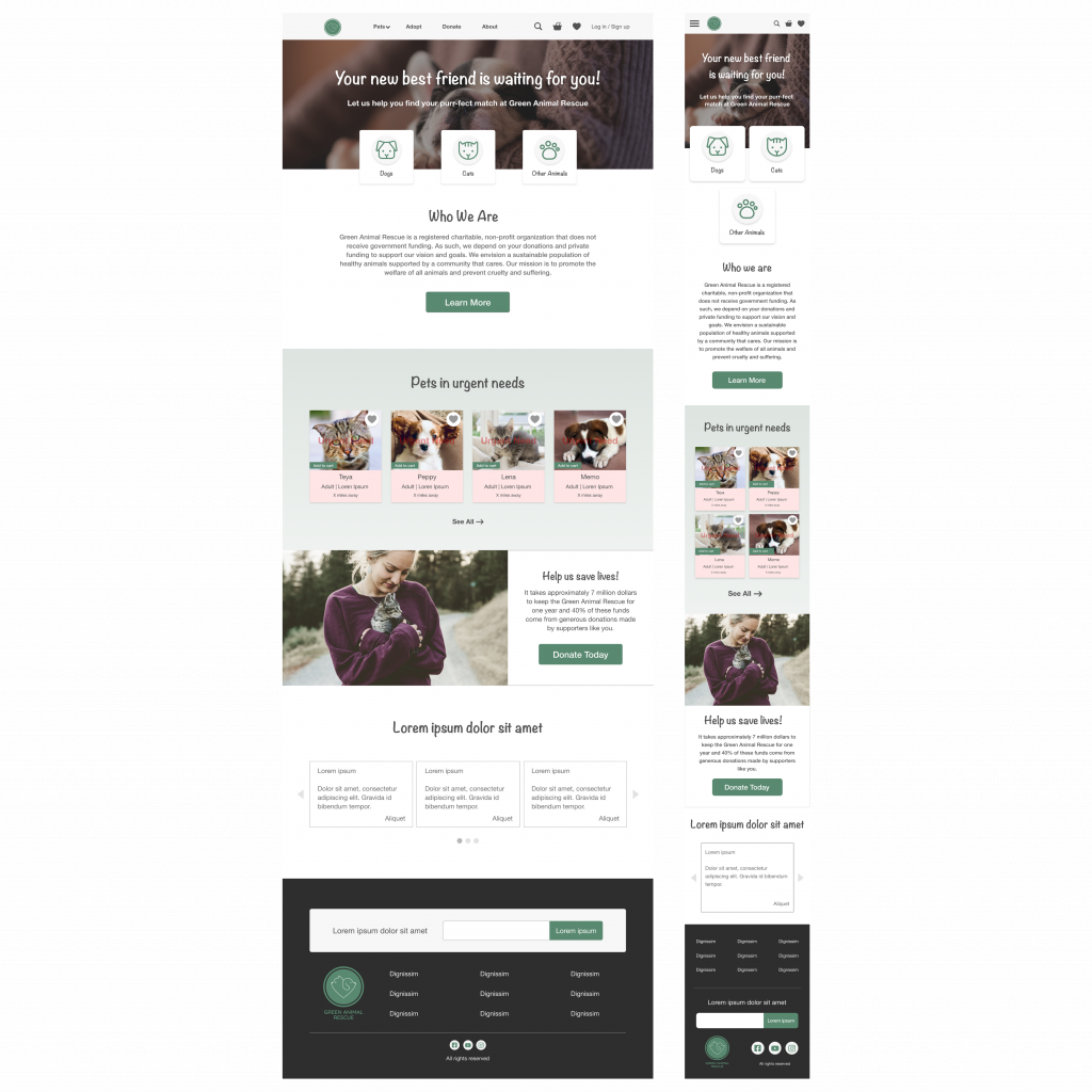
Mockup Screen Size Variation
I included considerations for additional screen sizes in my mockups based on my earlier wireframes. Because users use different screen sizes.
Accessibility Considerations
1
I used headings with different sized text for clear visual hierarchy.
2
I used landmarks to help users navigate the site, including users who rely on assistive technologies.
3
I designed the site with alt text available on each page for smooth screen reader access.
Takeaways
Impact
Users were happy with the new changes and new features added. They thought that the website has become more intuitive and much easier to understand.
What I learned
I learned that the usability study and iteration are very important and can have a huge impact on the user experience. The most important takeaway for me is to always focus on the users pain points and coming up with design ideas and solutions.
Get in Touch
If you are interested to work with me email me at sara.hajimiri@gmail.com

